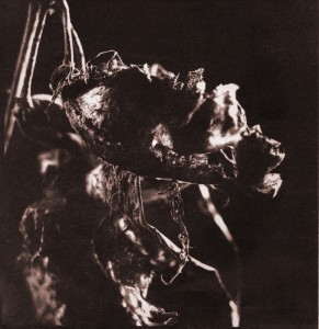
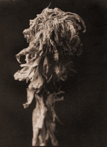
I have decided to upload a post dedicated to my alternative process work from the spring to now. Hopefully, this will not only inspire other photographers to try alternative processes but also give them some guidelines as to how to set yourself up to do them. Since I am still a student I have the luxury of having a lot of counter space, sink space, chemicals, trays, and experience to resource. Not only that, but I get to try out a lot of new things without having to go to twenty different [expensive] workshops. I’m not going to go too far in depth about each process; once the series of posts is done I’ll get some links up with specific information.
Salt Prints
I learned to do salt printing a year ago and this past year I honed my skills. Salt prints are relatively easy to make, have short exposures, don’t require many chemicals, and can produce very nice tones in a variety of colors ranging from brown to red to purple. They can also be toned in gold or platinum, similar to kallitypes.
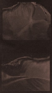 I use Stonehenge “Natural” paper from Graphic Chemical in Villa Park to print on. It is 100% cotton and domestic, which makes it cheaper than foreign made papers. Apparently, some of the additives in their “Bright White” paper seem to react with the silver, so bright white cannot be used. I have never had a problem with natural, nor have I needed to do any additional sizing.
Coating is two steps: salt then silver. Some people 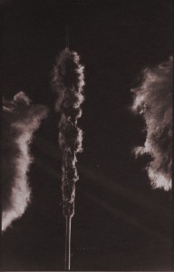 like to brush on the salt (1tbs sea salt to 1L water), but I have found that I get a lot of unevenness in the coating if I do it this way. This is visible on the print of cattails; the diagonal lines that look like streaks of light are actually inconsistencies in coating (I am not complaining). This print, along with all the other salt prints shown, was floated in the salt solution rather than brushed. The inconsistencies in coating are worse if the salt is brushed on.
When floated, it seems like they are smoother and therefore fit into the image better.
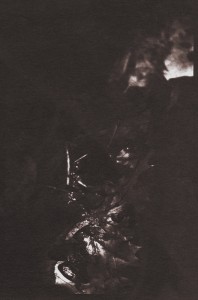
To float your paper, dump the salt solution into a tray and place your paper on top of the salt solution (I hope you marked it so you know which side is coated). Let it sink in for a minute or so, then hang it up to dry.
Once dry, brush on (in subdued tungsten light) a 10% silver nitrate solution and allow to dry in a dark room or with a blow dryer set to cool.
You can now expose with a digital or analog negative in the sun or under a UV exposure unit.
Expose until the print looks overdone, then rinse in a water bath (can be slightly acidified). After the first rinse the prints can be toned, if desired, then fixed in plain hypo.
All the jpgs shown have had their color adjusted to be as close to the real print as possible. I have no idea how to control the color (in the print). I’ve heard it has to do with the salt used and its concentration.
Palladiotype (Platinotype)
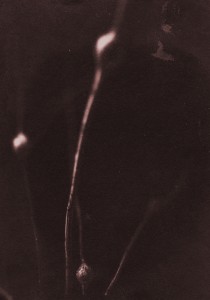
The platinotypes shown here have been made using the NA2 platinum kit from Bostick and Sullivan. My negatives were dense, so no platinum was added to the palladium to boost contrast. Therefore, they are palladiotypes and not platinotypes, officially.
The kit is really easy to use, and as long as you have some experience with alternative printing you will probably get the hang of it quickly. I bought a hake brush from Blick’s and it seems to work very well. It absorbs a lot of emulsion so wet it well before you start. Don’t get intimidated by pour-on developing. Just YouTube it.
Like I mentioned before I was using very contrasty 4×5 negatives. I scanned them into Photoshop and enlarged them to the 8×10 range. I applied the platinum curve, and when I went to make a print my exposures were all too thin. Turns out that my negatives were actually perfect on their own and didn’t need the curve adjustment. I exposed for longer and everything came out great. The negative looked like it was pretty much saturated in ink; I definitely couldn’t visually make out the highlight detail that came out in the print. Platinum likes density, so even though my negatives were dense, then even more dense after the curve, I got good results. The great thing about platinum is that you can expose forever, and you won’t lose much shadow but you’ll gain a lot of highlight detail. You could use overexposed negatives. The amazing tonal range plus the ease of the kit makes you never want to use silver again. Unfortunately, I can’t tone my palladiums blue… More specifically, I don’t want to screw them up by trying!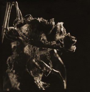 That’s all for this installment. Stay tuned for cyanotype, wet-plate, and gum.
